There are a variety of ways to achieve an email design that looks great on a mobile phone. Let’s take a look at the design and coding options that are currently available.
Responsive Design

Responsive coding relies on media queries, a type of HTML code that controls how an email or webpage adapts to different screen sizes and resolutions. Using media queries, designers can determine font sizes, image sizes, and whether images are shown, hidden or swapped based on screen size or a particular screen width break point. Responsive coding and design is the most common technique we use to help clients achieve email that looks great on a mobile device.
The pros: This coding style is versatile, allowing you to serve up the most functional design on both desktop and mobile. It’s possible to achieve email design that is pixel perfect. You can even use responsive design to organize content into multiple columns on a desktop view that then stack into one column on mobile screens.
The cons: Gmail does not accommodate media queries and will default to the desktop version in the Gmail mobile app.
Designing With Mobile in Mind
Designing with mobile devices in mind is one of the simplest coding techniques to use. If you don’t want to use media queries and break points, you can build a table-based HTML email that looks good on a mobile device. This design is based on the assumption that most mobile devices will reduce your design to fit the screen width. The designer will use a single-column design with larger graphics and font sizes to ensure readability on a small screen.
Sometimes this design technique is called mobile-friendly or scalable.
The pros: Your email will look great on the Gmail app, which ignores the media queries that responsive design relies on. Only basic HTML coding skills are required.
The cons: The Android native email app often displays this type of email at 100 percent, and the subscriber must pinch the screen to see the email without scrolling. It can be tricky to strike a balance when you are trying to get one design to look good on both desktop and mobile. You also won’t have the versatility that responsive coding provides.
Fluid Design

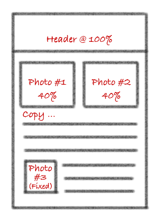
When using the fluid design technique, email content expands or contracts to fit the screen width upon which it is displayed. For example, as the screen width shrinks, the font size remains constant as copy flows into an increasing number of lines of text. Also as screen width shrinks, graphics can either shrink proportionally with the screen or remain a constant size. This coding style relies on percentage-based sizing to scale emails larger or smaller depending on screen size.
The pros: These are relatively easy to program and work best for text-heavy emails because there is less control over the positioning of copy and graphics. Fluid design is supported by mobile devices, including the Gmail app.
The cons: Copy can be hard to read when it extends across wide screens. Fluid design is not recommended for graphic-heavy emails.
Hybrid Design
Hybrid design uses a combination of fluid and non-fluid HTML tables. Designers couple this coding strategy with media queries and Microsoft conditional comments to create email that looks great on Gmail and other email clients.
Hybrid design has also been called spongy design.
The pros: Hybrid design is supported by almost all email clients.
The cons: Hybrid design is not recommended for complicated email templates that include multiple columns on desktop. Pixel perfection is not achievable with hybrid design.
We Can Help!
Feeling overwhelmed by the coding techniques for mobile email? We can help you design and code beautiful, functional email templates. Tell us what you need by calling 314-918-8088, ext. 106, or emailing .

