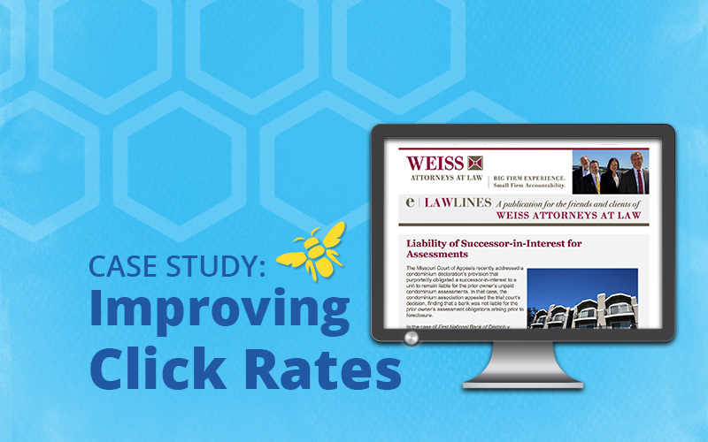
Weiss Attorneys at Law, a St. Louis-based law firm, has been sending a monthly email newsletter called E-LawLines to its clients and colleagues for the past 12 years. The successful newsletter addresses a broad range of legal topics of interest to business owners and individuals, as well as the occasional non-legal essay. In 2015, the average click-to-open rate for E-LawLines was 6.95 percent. We thought we could do better in 2016, so we began to review the e-newsletter’s content and calls to action to identify areas for improvement.
By implementing a few changes to this long-established newsletter, we saw a substantial increase in the average click-to-open rate, driving it up to 12.13 percent in 2016. That’s a whopping 75 percent increase over 2015.
So how did we do it? Here are a few tactics we employed to get these impressive results.
Shorten Up the Teasers
A teaser is a paragraph or so of copy written to hook subscribers’ interest and entice them to click to see the entire article. Determining the right amount of teaser copy is one part art and one part science. For email, you want to write just enough to get the click to the website containing the full article but not enough to give away the punchline in your teaser. If a reader decides an article is not of interest to them and therefore doesn’t click to the website, they miss the opportunity to read or skim the article you are promoting. They also do not see related articles and other content on your site, like your products, services and about us page.
Too much copy, on the other hand, can overwhelm a reader or help a reader decide to move on without clicking. In 2015, the average teaser length in E-LawLines was 170 words. In 2016, we cut the average length down to 92 words.
Link Everything to the Landing Page
Part of our 2016 email quality assurance checklist included ensuring the headline, image and call to action all link to the article. While this may seem like a no-brainer, unless you have a process in place to ensure all links have been applied, it’s easy to forget to link up an image or a headline while building an email.
Ditch the Graphic Calls to Action
In our original template, our designer created an image for the “read more” link. While there are benefits to doing this, including having absolute control over the look of the button, there are also risks. For example, if a subscriber has images turned off, he or she will not see the button and therefore will not know how to see the full article. Litmus estimates that more than 40% of subscribers view email with images blocked. To make sure all readers can read the call to action, we now use either an image-based button, which appears even if images are blocked, or we simply link a line of copy.

About That Read More Language
Let’s talk a bit more about using “read more” as a call-to-action link. For skimmers, read more is a snore. Instead, use your call to action text to explain the value of clicking. Consider that subscribers may not read your teaser and may skip directly to the call to action link. Here are a few different ways we wrote benefit-based calls to action in 2016:
- Learn what you need to do to remain compliant.
- Read more about short-term rentals.
- Read on to see how this case was resolved.
How Can We Help Drive More Traffic to Your Website?
Email newsletters are a fantastic way to get more eyes on your company website. We’d like to help you start or improve your email newsletter. Call 314-918-8088 or email to learn more about our strategy consulting services.

